- Pain. The Databricks bill lands as a single number; breaking it down by workspace, cluster, job, or team means manually cross-referencing the console, the cloud-bill export, and an internal dashboard.
- Who it is for. Data platform leads and engineering managers owning Databricks cost across workspaces and jobs.
- What it is. Altimate's Enterprise Platform breaks Databricks cost down by workspace, compute, warehouse, job, user, and SKU across every cloud.
"Where Did The Databricks Bill Go" Is The Wrong Shape Of Question To Answer In Spreadsheets
A retail-data platform lead inherits a Databricks workload that runs across three workspaces (dev, staging, prod), about 40 jobs, 20 SQL warehouses, two cloud providers, and four engineering teams. The monthly cost review starts the same way every time: open the Databricks console for each workspace, copy the usage page into a sheet, open the cloud-bill exporter for the cross-check, open the team's Looker dashboard to map the spend to the workload tags. By the time the picture is built, it is Friday afternoon and the review meeting is Monday.
The pattern is mechanical and slow. Six different dimensions of the bill, six different consoles, one platform lead. The right shape is six dedicated pages, each one answering the dimension's question, all on one cost product.
Six Pages, Six Dimensions, One Product Surface
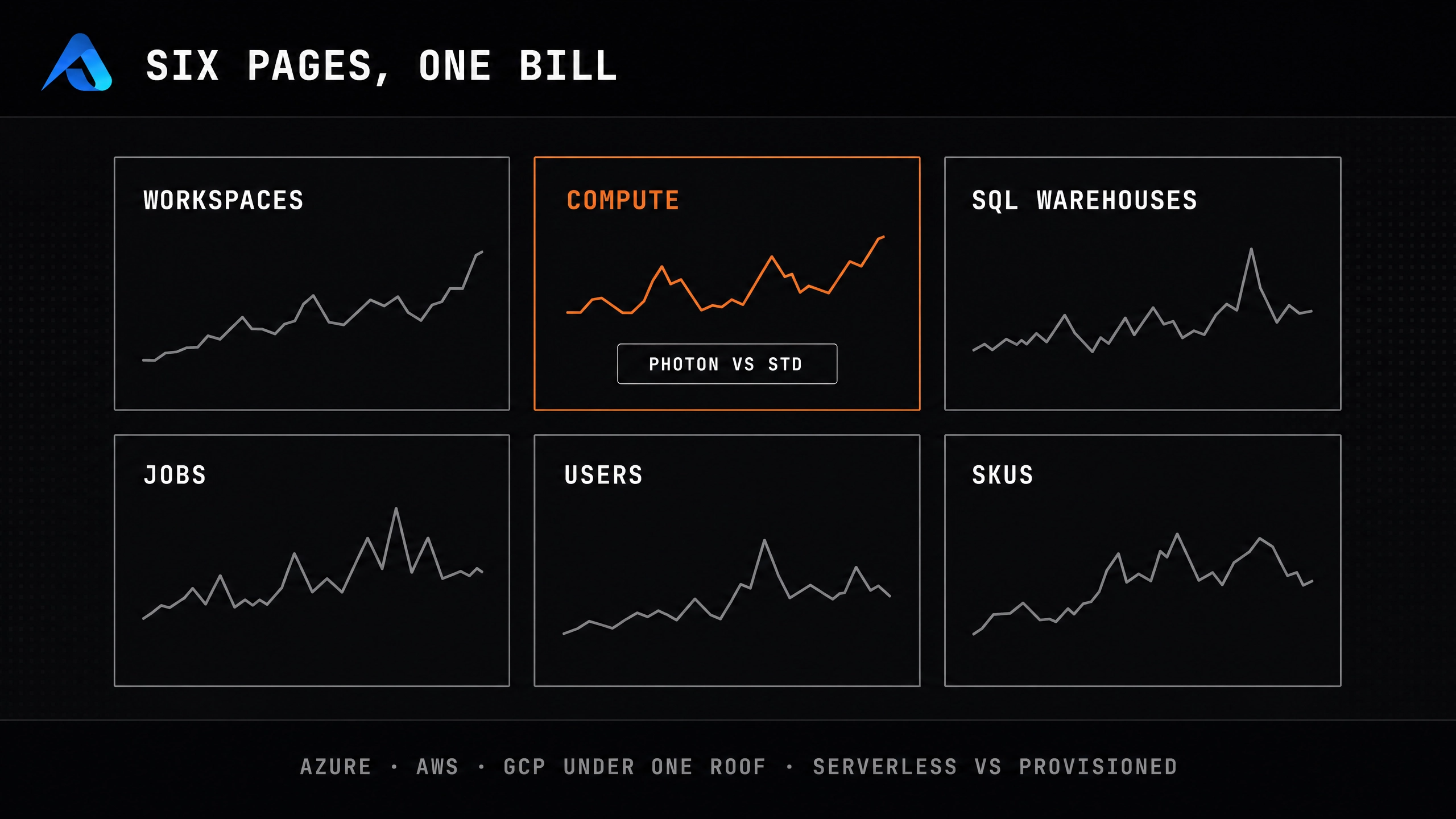
The Enterprise Platform breaks the Databricks bill into six dedicated pages, each answering one dimension's question:
| Page | Question it answers |
|---|---|
| Workspaces Cost | which workspace burned which fraction of the bill |
| SQL Warehouses | daily SQL Warehouse spend, sortable and filterable warehouse list |
| Jobs | success/failure run trends, per-job duration and cost |
| Spark analysis | stage-level Gantt charts, task drill-downs, config tabs |
| Users | per-user cost attribution with a summary chart |
| SKU Cost | serverless vs provisioned, Photon vs standard, plus the existing SKU breakdown |
| Compute | All-purpose Compute and Jobs Compute as separate tabs, URL-reflecting, single-card layout |
A Databricks tenant gets a Databricks-specific Summary page that replaces the Snowflake layout, workspace cost at the top of the sidebar, and a navigation that hides Snowflake-only sections. The three deep-dive pages and the Databricks summary sit together for Databricks tenants. The lead's Friday morning becomes a Friday hour, on one product.
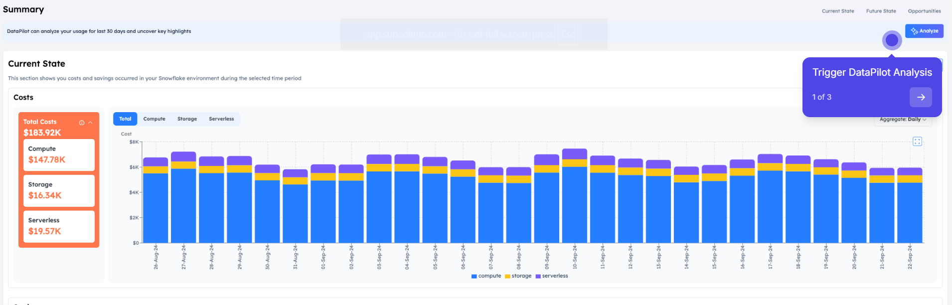
The Summary page a Databricks tenant replaces is worth seeing directly: on a Snowflake tenant, the same underlying DataPilot engine breaks the current-state total into compute, storage, and serverless, then offers to analyse cost drivers or predict the next period:
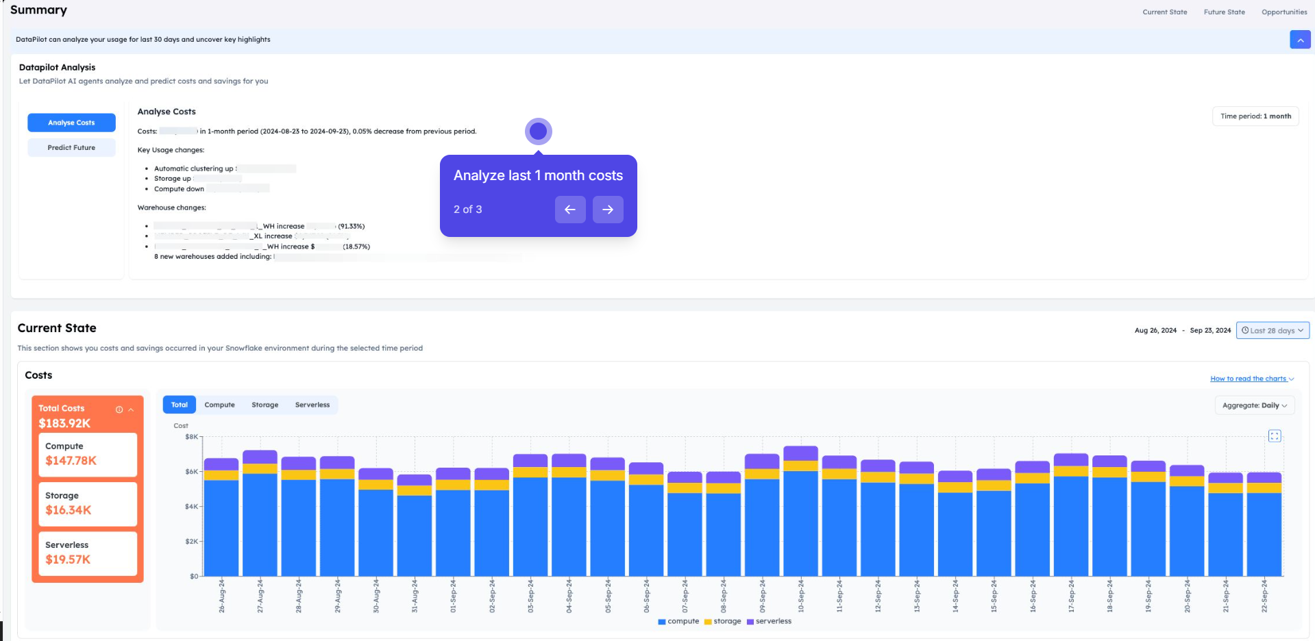
Clicking "Analyse Costs" surfaces the specific warehouse and usage changes behind the total, in plain English rather than a raw query log:
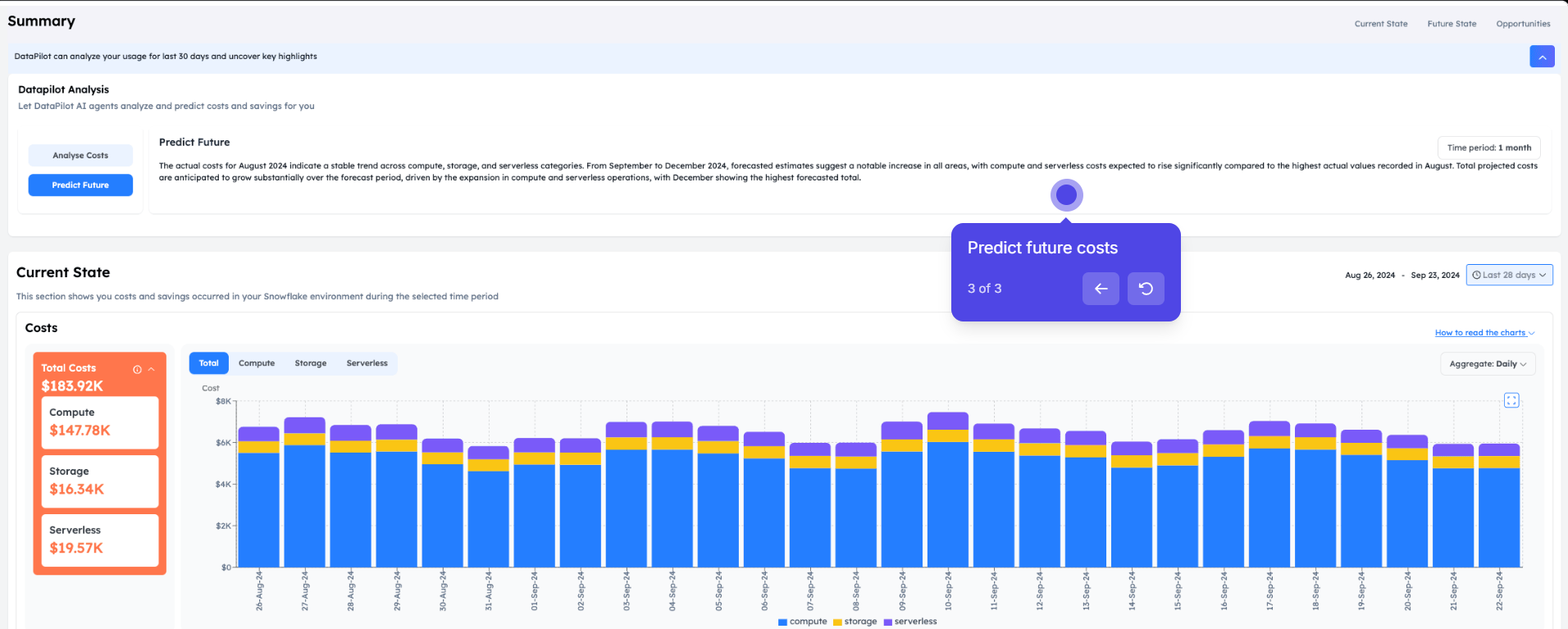
"Predict Future" runs the same engine forward instead of backward, projecting where compute, storage, and serverless spend are headed:
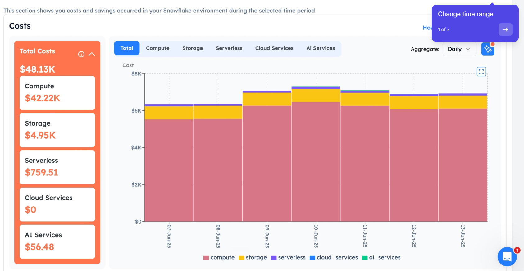
A different Snowflake tenant's Summary page shows how the category breakdown grows as more of the platform is adopted, here with Cloud Services and AI Services added alongside the original three:
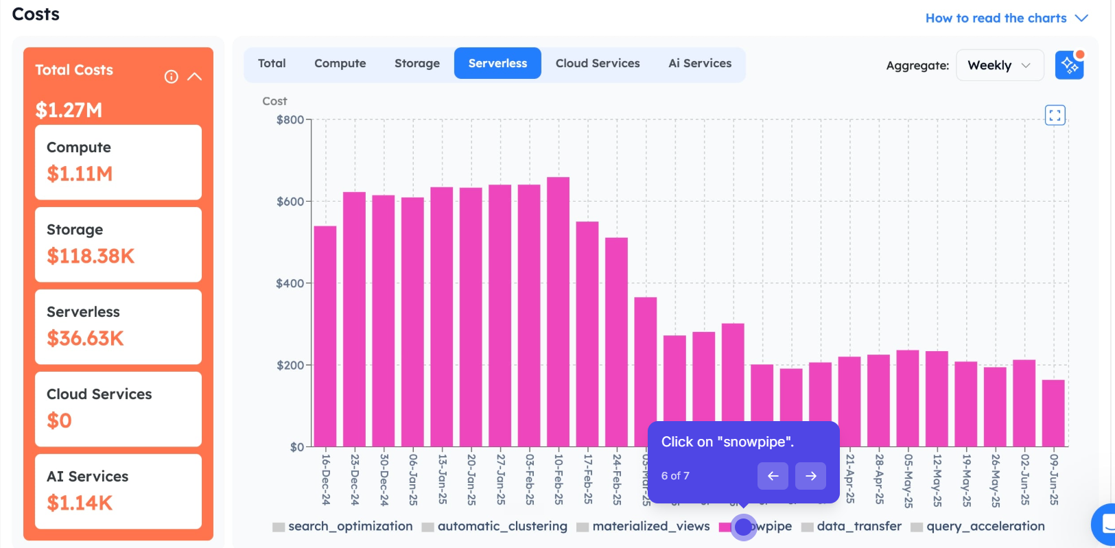
Each category drills further: here the Serverless tab on another tenant breaks a $1.27M total down into its own sub-drivers, from Snowpipe to automatic clustering to query acceleration:
The SKU Page Is The Answer To "Why Did The Bill Change Shape"
The most-asked question on a Databricks bill is some shape of "the total looks the same but the mix changed". The SKU Cost page answers it directly. Two cost-trend cards split the same total by:
| Dimension | What it answers |
|---|---|
| Serverless vs Provisioned | "are we burning more on serverless this month" without exporting to a spreadsheet |
| Photon vs Standard | "did the Photon migration pay off this quarter" |
Both views pair with the existing SKU breakdown. The cost-breakdown-by-product side stays fast for tenants with long histories, so the page reaches first paint sooner on wide date ranges. The mix changes; the page shows the shift, not just the total.
The SKU Cost page itself, broken down by SKU: total cost, total DBUs, and active workspaces at the top, then every SKU (Premium Serverless SQL Compute, Premium Jobs Compute, and the rest) ranked by spend:
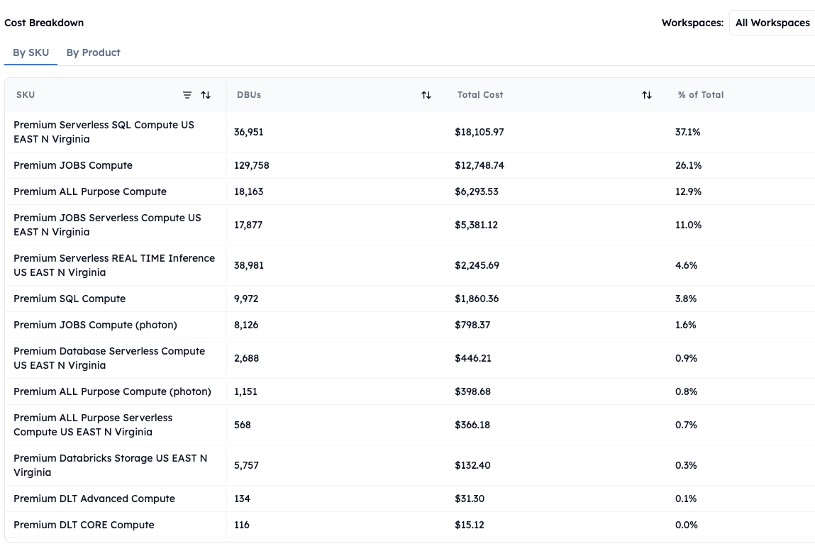
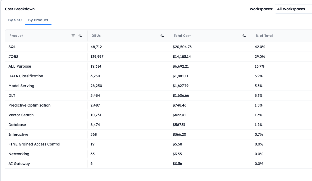
The same total, sliced by product instead of SKU, so the platform lead can answer either "which SKU" or "which product line" without leaving the page:
A Worked Review On The Friday Morning That Used To Take All Morning
The Friday morning loop, after the six pages landed:
- Workspaces. Open the page. See
prod-eastup 18% week-on-week,stagingflat,devdown. The signal is inprod-east. - Compute. Open the Compute page, switch to the All-purpose Compute tab. The cost-trends chart isolates the cluster that drove the rise; click the legend to compare against the prior period.
- Jobs. Open the Jobs page. Follow the job that runs on the suspect cluster down through the Spark analysis stage-level Gantt to the task that doubled in duration.
- Users. Cross-check on the Users page. The cost spike attributes to one analyst doing exploratory work on the All-purpose cluster that should have run on Jobs Compute.
- SKU. Confirm the conclusion: the serverless line on the SKU page picks up the spike on the same dates.
Five page-loads, one investigation, one answer. The companion Spark analyst agent in Studio traces the same root cause from app down to task in plain English; the panes-and-Studio pair is the investigation pattern across the surface. The bill stops being a black box.
Azure Databricks Under The Same Roof As AWS And GCP
Azure Databricks closes the multi-cloud gap. Its workspaces connect from the same connections UI as the AWS and GCP forms. Two paths:
| Connection type | When it fires |
|---|---|
| Standard Azure Databricks workspace | direct connection |
| Azure Private Link variant | workspaces fronted by Azure Private Link |
Each connection persists as its own entry; multiple Azure workspaces per tenant are supported side by side. The Workspaces Cost page, the Compute page, the SQL Warehouses page, the Jobs/Spark/Users pages, the SKU Cost page, all of them work on Azure workspaces the same way they work on AWS and GCP. One cost product, three clouds.
What The Six Pages Give The Team The Spreadsheet Did Not
The six dimensions are the dimensions a real Databricks bill needs:
- Workspace answers the cost-attribution question across dev/staging/prod
- Compute (All-purpose vs Jobs) answers the workload-fit question
- SQL Warehouses answers the BI-and-ad-hoc question
- Jobs + Spark + Users answer the per-engineer / per-pipeline question with task-level depth
- SKU (with Serverless/Provisioned and Photon/Standard) answers the mix-shift question
- Cross-cloud is a connection-form fix that brings Azure into the same surface
The companion Auto Tune article covers the right-sizing layer that runs on top of the Compute panes. The Studio cost analysis article covers the conversational layer that the panes feed. The scheduled artifact article covers the recurring report the team ships from the conversation. Six panes; one product; the Friday morning is now Friday's first hour.